

Files
Download Full Text (594 KB)
Description
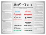
It has become common for companies to do rebrands from more detailed, complex branding to simple and bold branding. With lettering, there has been a trend of companies shifting from script to sans serif typefaces. This pattern brought us to the question, why? It’s important to understand trends in graphic design like this one to get a better grasp of marketing strategies and consumer preferences. It’s also good practice as graphic designers to stay up to date with social and cultural shifts, so we can apply that knowledge and make smart design choices. While there isn’t much research on this change in particular, there is some on individual cases of rebranding, which is what we developed this project around. Specifically, the project focuses on 16 different case studies of companies that have rebranded from script to sans serif typefaces. The case studies explore the history of the selected brands and their logos, focusing on why they switched their branding. Three commonalities developed across the reasoning, one being a change in the company body (such as a shift in ownership), the second being a change to keep up with modern technology and trends, and the third being an outlier case, found with Pinterest. This outlier case was due to the lack of specific reasoning behind their logo and branding switch. It’s important to continue investigating changes in branding so we can learn from these instances how people interact with certain styles of graphic design and use that understanding in our own work.
Publication Date
7-22-2025
Document Type
Poster
City
Grand Forks, ND
Keywords
Graphic design, Branding, Typefaces, Script, Sans serif
Disciplines
Graphic Design
Recommended Citation
Brayton, Angela and Derouard, Abigail, "Script to Sans: The Shift Toward Minimalist Branding" (2025). Arts & Sciences Undergraduate Showcase. 27.
https://commons.und.edu/as-showcase/27
Comments
Presented at the Spring 2025 Arts & Sciences UNDergraduate Showcase in Grand Forks, ND, May 8, 2025.